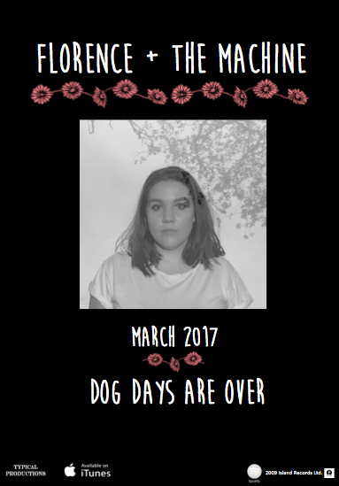
Below is a mock-up of my advert, this allowed me to choose a firm structure for the advert and to also show it to others and gain feedback on what I can improve. I believe the synergy of the flowers from the digipak is effective and the text is clear. The overlay helps to keep the image constant with the other images from the digipak. The iTunes symbol and Spotify symbol allow people to know where they can access the album. Also by having my production company on it, I am receiving free advertising that may attract new clients.
I have realised that I need to add more icons at the bottom and I am also going add a QR Code to the music video I have created to allow the public another way of accessing it. To keep up the pattern of the flowers I am going to add another row under 'Dog Days Are Over'.
Over all I am happy with my mock-up and with the improvements it should make the quality of my poster better.


No comments:
Post a Comment